
OVERVIEW
Auther is a clothing project I began in 2022 with a focus on creating simple, timeless garments that utilize premium materials and expert craftsmanship. The brand aims to deliver elevated essentials for those who appreciate the details.
SERVICES
Art Direction
Visual Identity
Product Design
CREDITS
Photography: Max Held & Mike Stockwell
Models: see images
Typeface: Made Avenue


ART DIRECTION
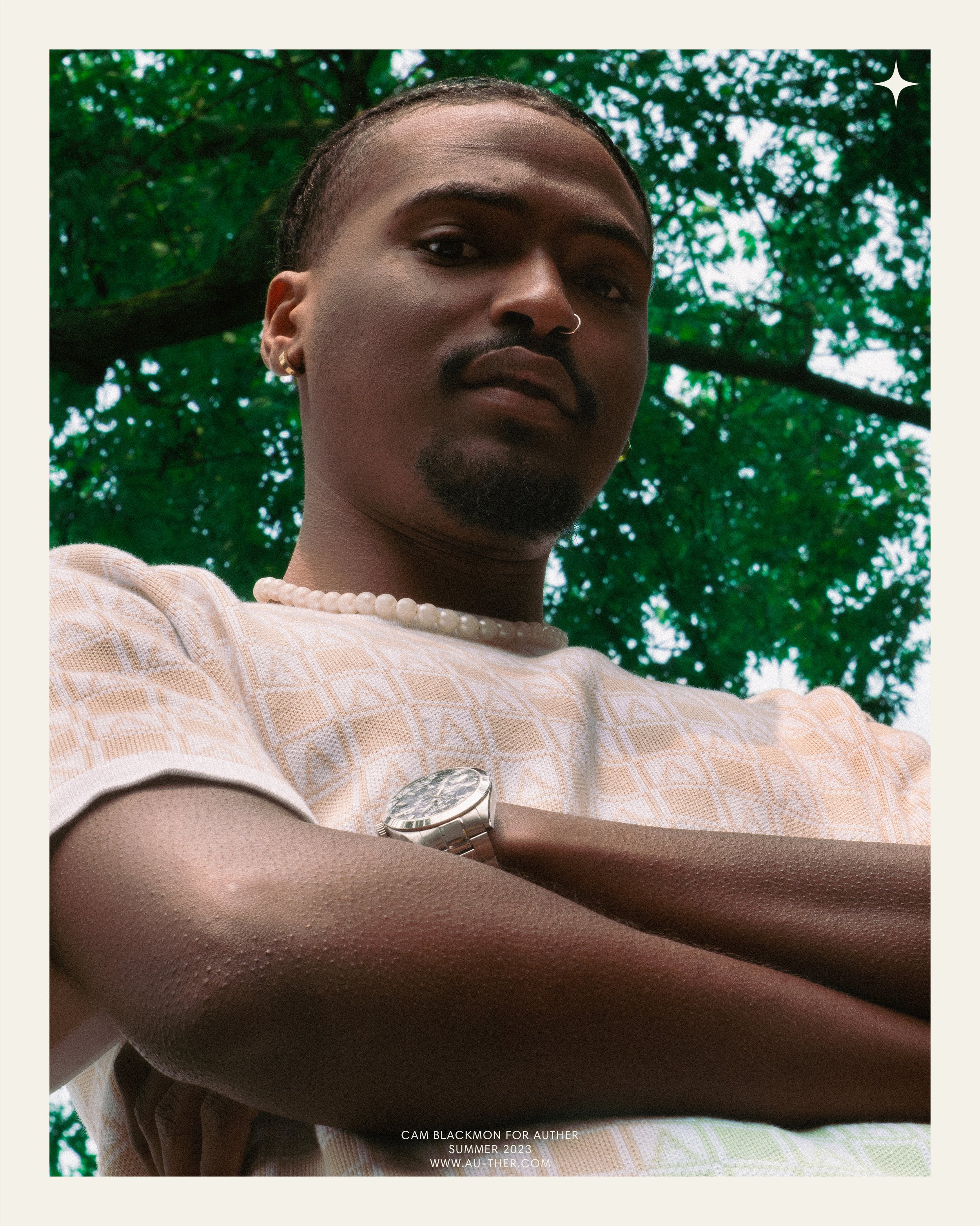
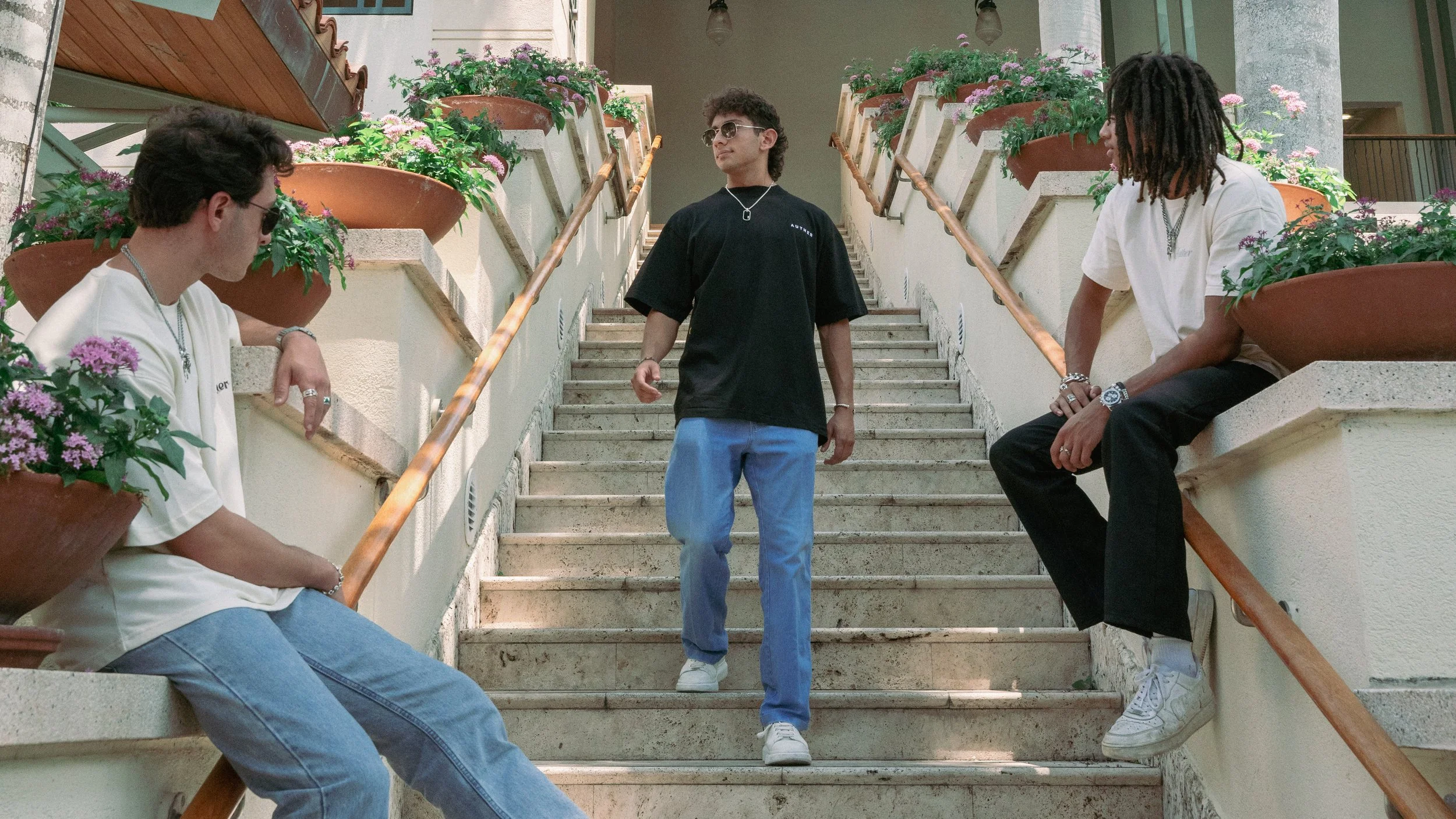
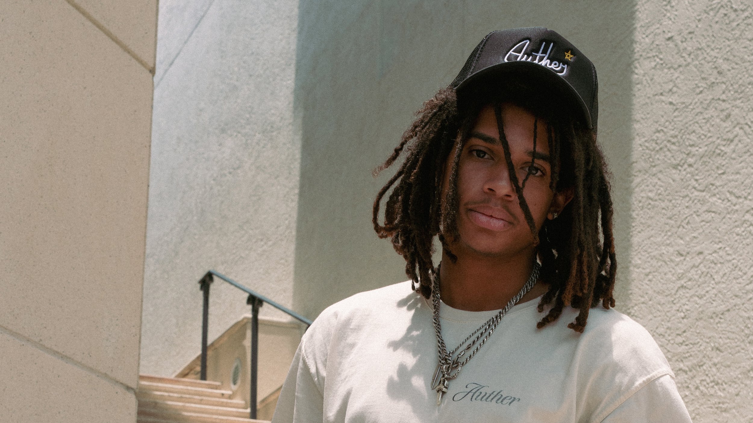
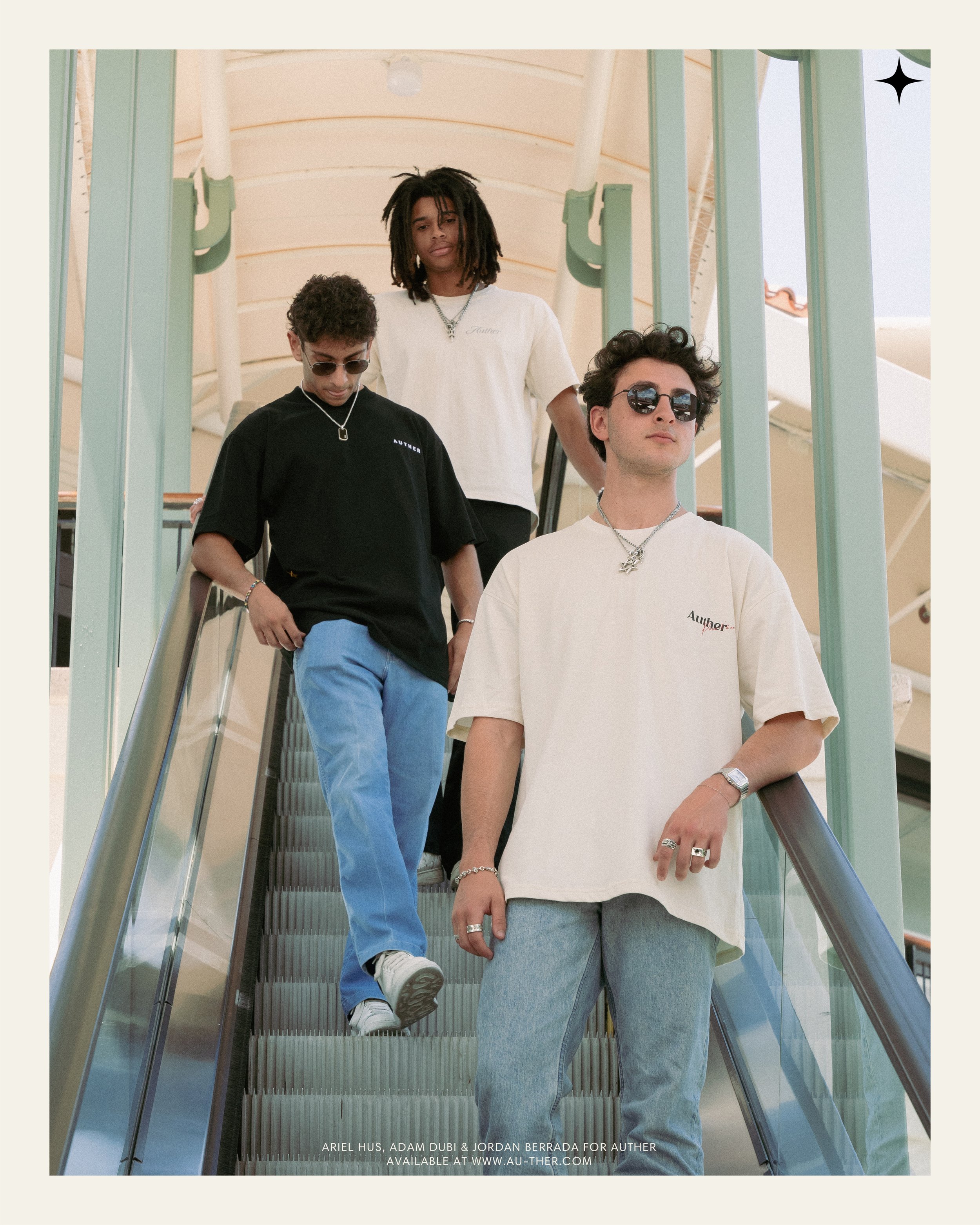
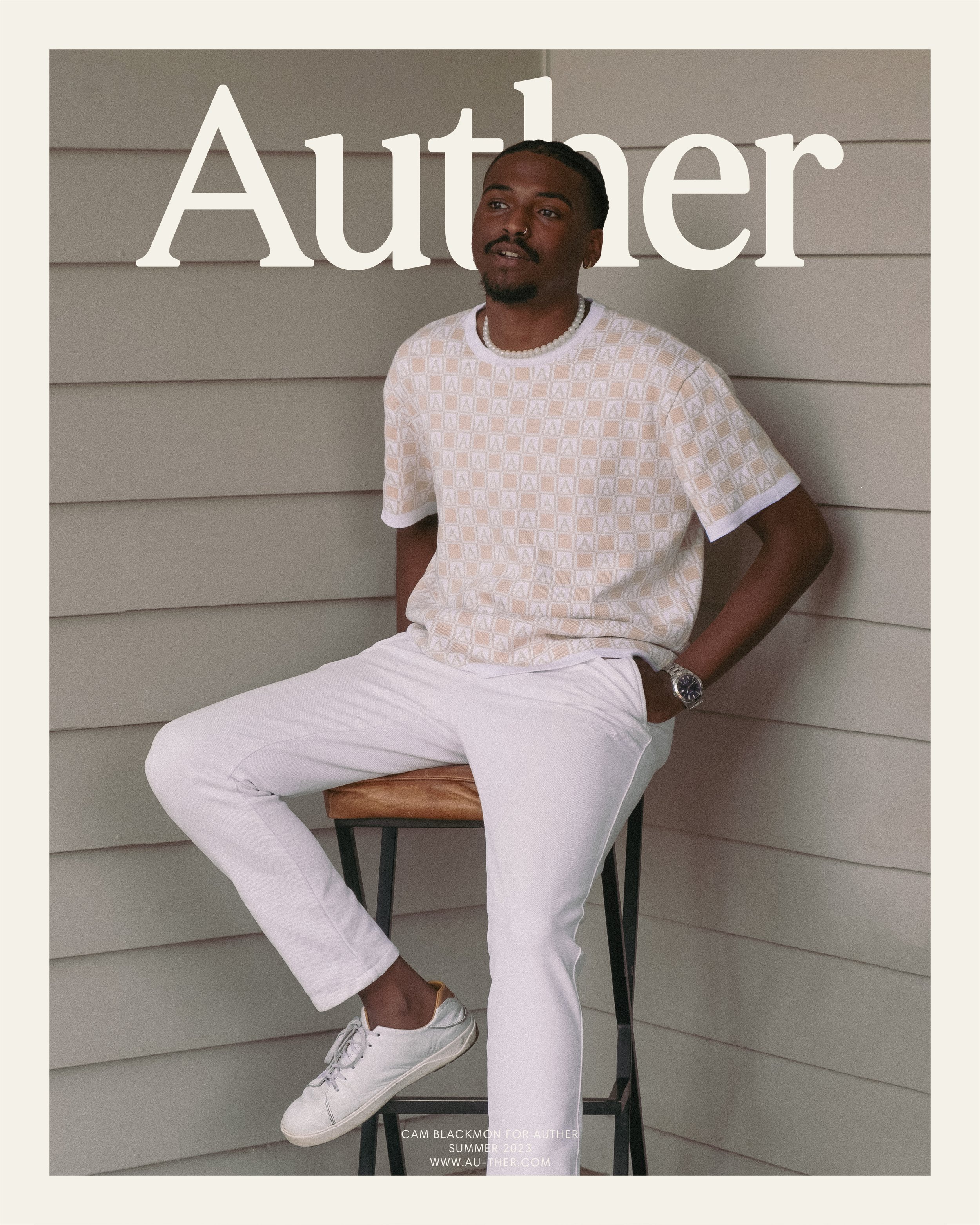
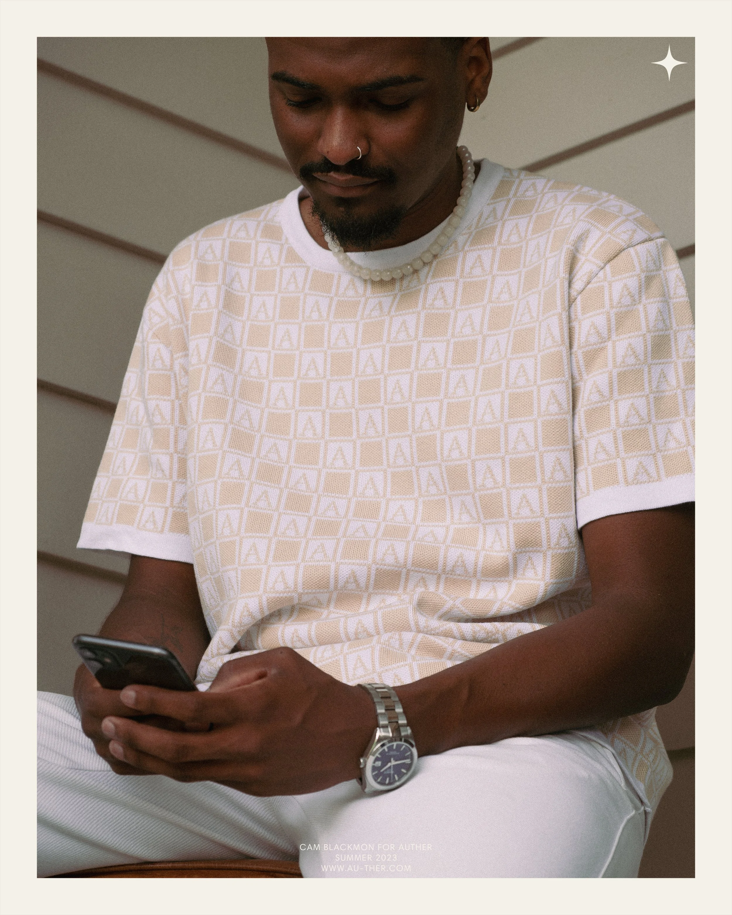
The imagery and colors of the brand enforce the classical and contemporary aesthetics introduced by the logotype and logomark. Photoshoot locations were chosen with color at the center, leaning into the earthy color palette found throughout the brand. Post production was focused on ensuring consistency across visuals; a brightly-lit environment, a splash of haziness, and a touch of grain are at the core of the visual composition. This combination of effects helps convey a calm, dream-like aesthetic while still maintaining a clean image.



VISUAL IDENTITY
The visual identity is designed to explore the contrast between organic and geometric elements. The typeface for the logotype was chosen to evoke contrasting, yet complementary feelings of classical and contemporary aesthetics. The serif letters introduce a degree of elegance, while the bold lines of the characters create a sense of modernism. The four-point star as the logomark was chosen for its simplicity and geometric essence, qualities that are consistently within the brand's design ethos.



Product DESIGN
Garments were designed with a relaxed fit in mind. Measurements were taken of some of my favorite tees from my personal closet as a baseline. These measurements were then analyzed, deciding the best aspects of each garment. Finally, the measurements were combined and adjusted to work together to form one cohesive unit with the ideal fit.


