


OVERVIEW
Mesh is a technology company focused on improving the retail shopping experience for both companies and consumers. Many retail companies have rewards programs to incentivize brand loyalty and repeat purchases. However, the rewards earned exist within separate user profiles and applications, making it more difficult to keep track of for the consumers. Mesh aims to fix this inconvenience by conglomerating the different rewards programs into a cohesive platform where users can earn, spend, and even exchange points from a single account and mobile application.
SERVICES
Visual Identity
UX Design
UI Design
Brand Identity
SOFTWARE
Adobe XD
Adobe Photoshop
Adobe Illustrator


VISUAL IDENTITY
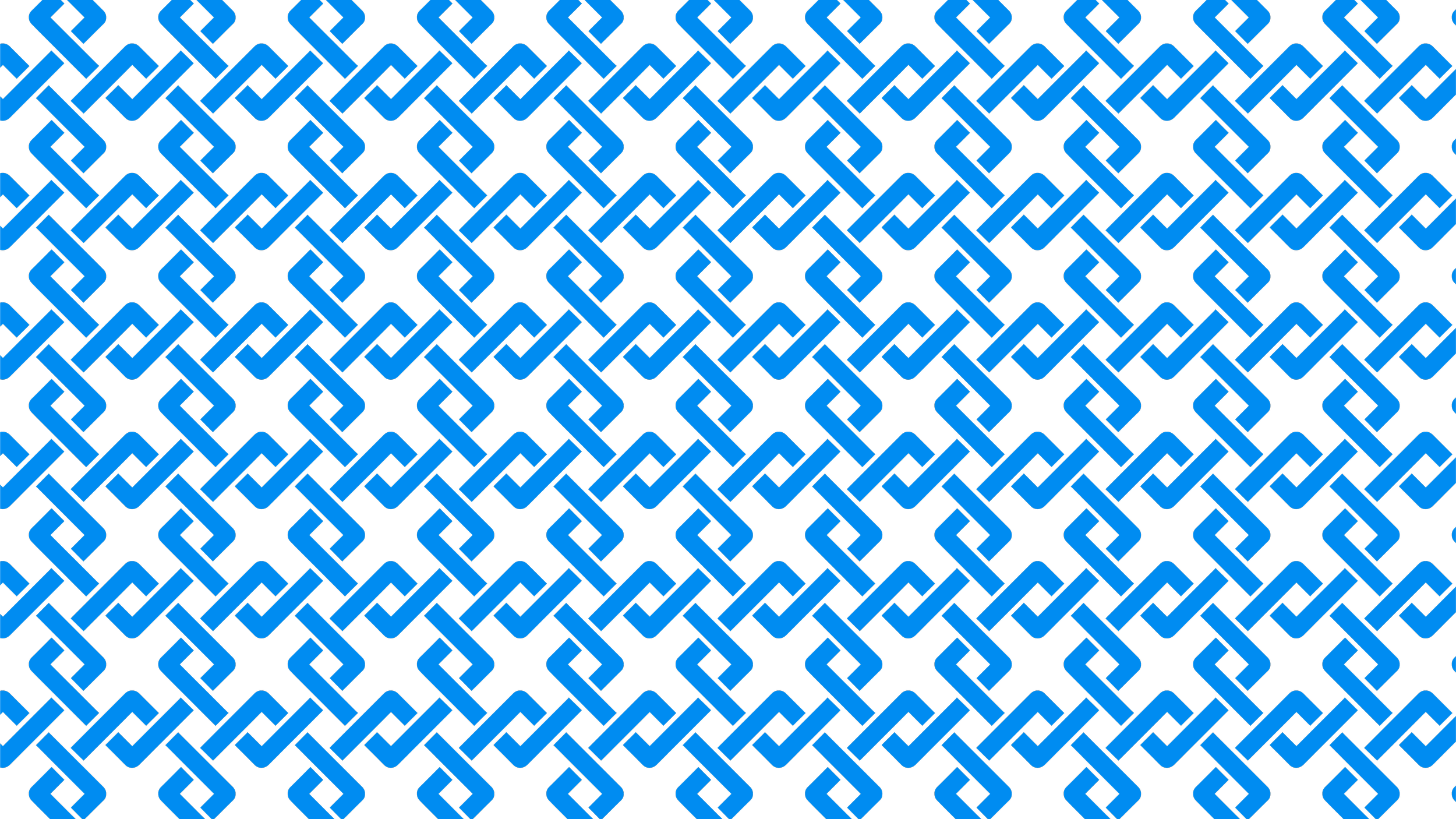
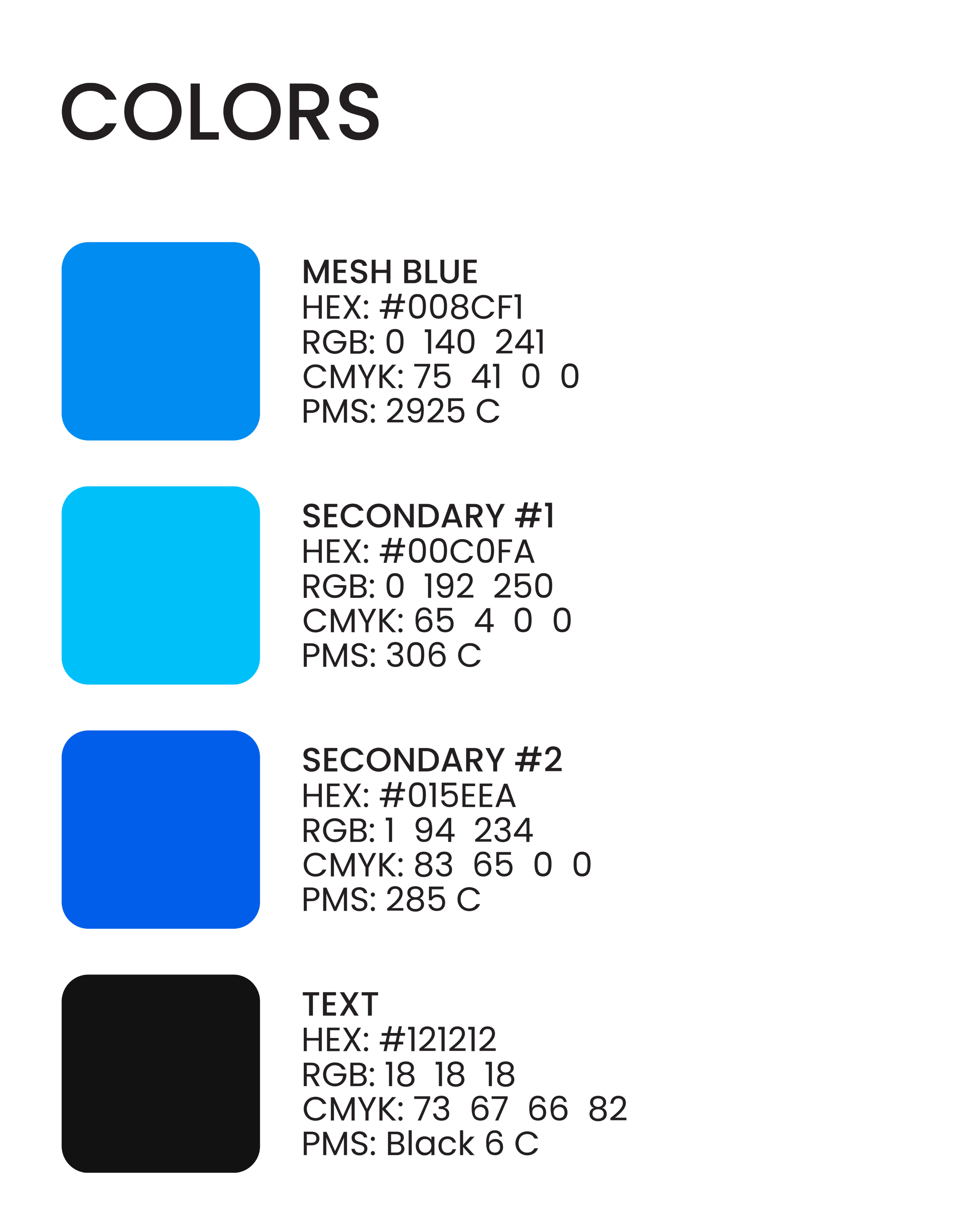
The name “Mesh” was chosen to enforce the idea of one account being usable across many different retailers on a single platform. The logomark further emphasizes this concept, depicting intertwining threads. Gaining consumers’ trust is important for any fintech company, and thus a bright blue was chosen as the company color to symbolize trust and reliability, as well as give a friendly feeling to the company. This is complemented by soft, rounded edges and comfortable spacing within the logomark, as well as throughout the mobile application.


UI DESIGN
The user interface for the application is meant to feel exciting and fun to use, while maintaining a high level of familiarity. Thorough use of color invokes a feeling of playfulness, while rounded edges and generous spacing ease any visual stress, especially for new users.

UX DESIGN
The mobile application was designed with ease-of-use at the forefront. Standard practices were adopted from other well-established mobile applications with similar functionality. As an iOS-first application, Apple’s Human Interface Guidelines were referenced to ensure maximum usability, such as for hit target sizing. Color is strategically used to draw users’ attention to key features of the application.